As part of my learning with Photoshop I decided to create a remake of a picture I took of my wife Jill several years ago wearing the Pachydermos mask, as seen below.
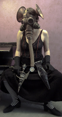
I figured with my new camera and lighting equipment that I could improve on the original, which was not well lit and a bit out of focus.
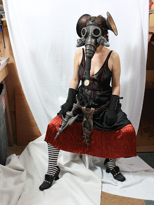
First I posed her on a white background for easy extraction in a pose similar to the first one, and with most of the same costume.
I then went to
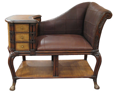
stock.xchng to look for free pictures that they offer for the furniture and interior. Here is a great old telephone table that looks like it could be Victorian, which is the look I was after.
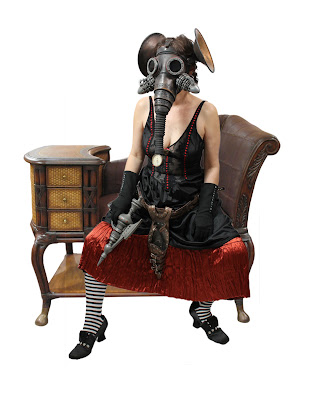
After extracting the figure in Photoshop (removing the background) I combined her with the seat, resizing them as necessary to make it look like they went together.

Next I looked for wallpaper and discovered this pattern on
DeviantArt, which was offered for free usage.
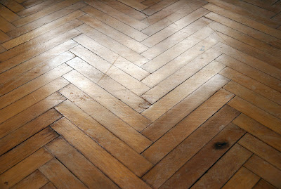
And back on stock.xchng I found a nice old floor.

I decided that a wanted poster for our heroine would be a nice touch, and created this one in Corel Draw. I then combined all the images, and photographed and added in some miscellany to populate the floor for my final image, seen below.
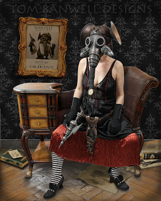
My original plan was to extract the figure and find a single photo to place her in. I ended up with ten separate images which make up the final picture.
 I figured with my new camera and lighting equipment that I could improve on the original, which was not well lit and a bit out of focus.
 First I posed her on a white background for easy extraction in a pose similar to the first one, and with most of the same costume.
 I then went to stock.xchng to look for free pictures that they offer for the furniture and interior. Here is a great old telephone table that looks like it could be Victorian, which is the look I was after.
 After extracting the figure in Photoshop (removing the background) I combined her with the seat, resizing them as necessary to make it look like they went together.
 Next I looked for wallpaper and discovered this pattern on DeviantArt, which was offered for free usage.
 And back on stock.xchng I found a nice old floor.
 I decided that a wanted poster for our heroine would be a nice touch, and created this one in Corel Draw. I then combined all the images, and photographed and added in some miscellany to populate the floor for my final image, seen below.
 My original plan was to extract the figure and find a single photo to place her in. I ended up with ten separate images which make up the final picture.

What a GREAT JOB Tom and Jill....wonderfully done... Photoshop is a dream come true for the artist... and you a living a Great Dream...
ReplyDeleteBest to you both
J&R
Tom, I absolutely love your work. You're such an inspiration and I love seeing your work.
ReplyDeleteTwo pointers/suggestions on photoshop: if you use the blur tool on the outer edges of the background, the subject (your lovely wife) of the picture will lookm more in focus, as in a regular picture.
And also, possibly add a shadow beneath the layer with your wife?
Just suggestions, I feel awkward giving suggestions to someone I look up to as an artist.
That was supposed to say seeing your work every time you post with something new. Still as redundant but I feel better about that grammatical blunder.
ReplyDelete@oxmadhatterxo I appreciate your suggestions, as I am so new at PS, although I don't completely understand them. I did burn the floor under her feet, and also on the seat I burned around her a little bit. Do you mean something else by "add a shadow beneath the layer with your wife"?
ReplyDeleteAnd I tried a Gaussian blur on the wallpaper and wanted poster bu felt it didn't add. Rather it made the poster hard to see. What do you mean "on the outer edges of the bg"? Do you mean just blur the perimeter of the wallpaper?
Thanks, Tom
Tom,
ReplyDeleteI have been following your work for years and truly admire it.
Your Photoshop work to date has been inspired, and you clearly have a great eye for it. Since you are new to Photoshop though, I hope you will take these suggestions in the spirit they are meant.
If possible, choose your stock photos first, since those are the ones you have no control over. These will dictate the lighting in the photo you take. Be aware of where the light is coming from and its strength in your background so you can replicate it appropriately when you take your photo. Also be aware of reflected light, the light that glows on the off side of an object. This will give your photos more depth. Also, a white background may not be the best because it will reflect light, often in unwanted ways.
Rather than the Gaussian Blur filter, try Lens Blur. This is designed to replicate the effects of a camera lens to create depth of field and similar effects. Search for a tutorial if you are wondering about the settings.
Keep up the great work!
Phil
@PilO Thanks, Phil. I appreciate it. I'm very wet behind the ears with PS. I've been reading books and watching video tutorials on the subject, learning a great deal from both. The glare on the floor was a real problem, which I toned down somewhat, but is still distracting. And the reflective surface of the table makes it difficult to match.
ReplyDeleteBest, Tom
After reading all the comments, I feel it may not look perfect to the professional photograher, but to a lay person such as myself...
ReplyDeleteI THINK YOU WERE RESOURCEFUL, USED GREAT IMAGINATION AND CREATED A WONDERFUL PHOTO!!